Where to begin? We have only completed the front façade of our home so far – it’s a lot of work. This blog shows how we went from a simple front (which was perfectly nice) to the restoration of the original 1910 look. It’s been a process! We have been blessed by the wisdom of others along the way so hopefully you find value too on your restoration journeys. Or just some joy looking at great craftsmanship by our restorer.
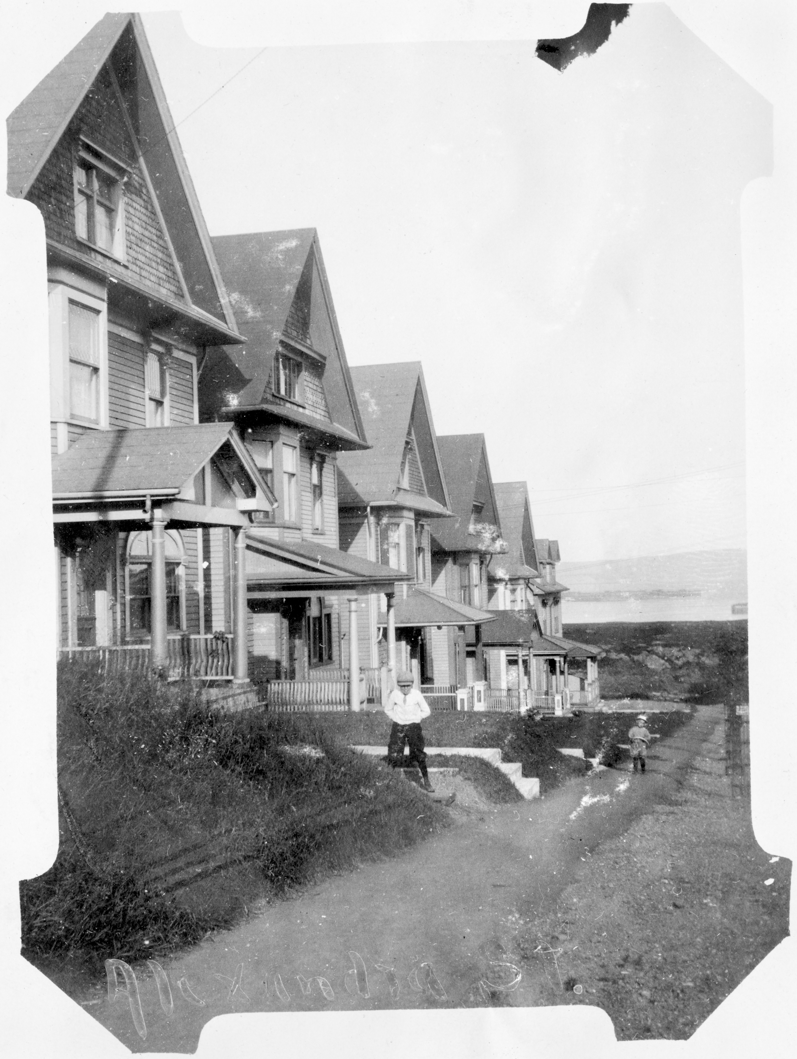
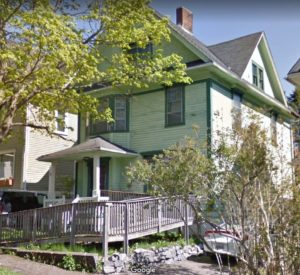
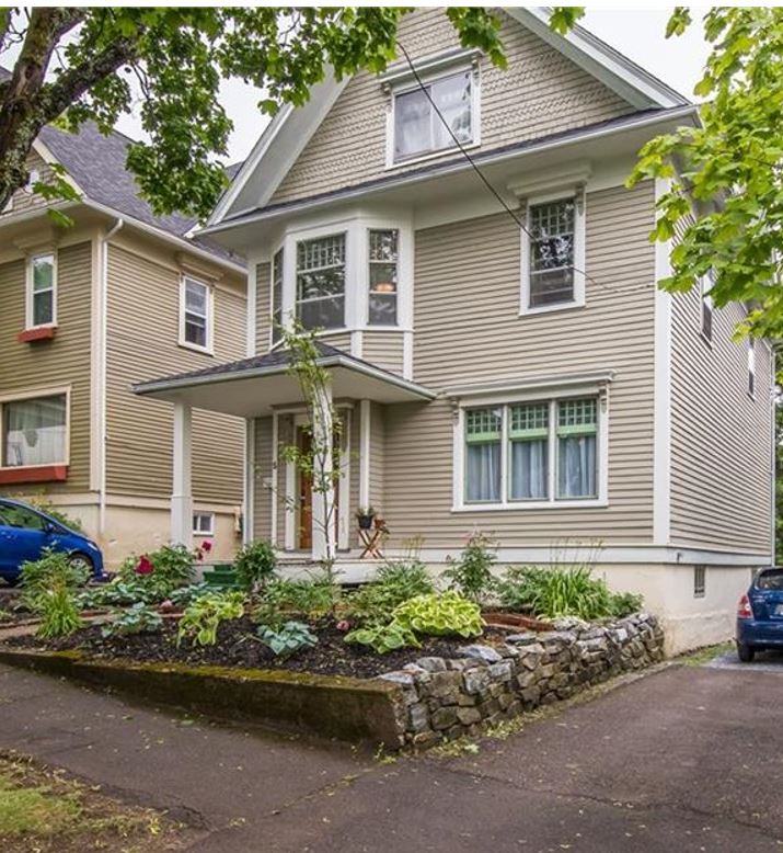
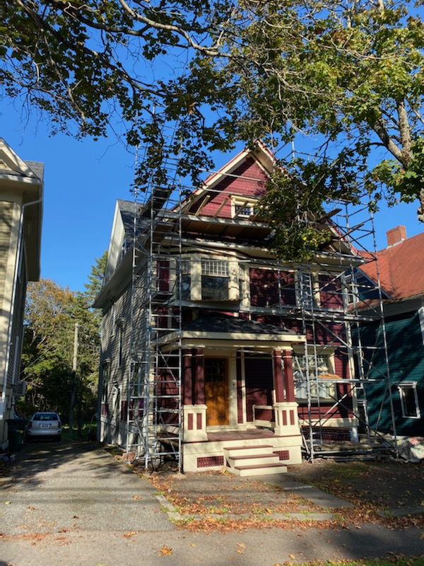
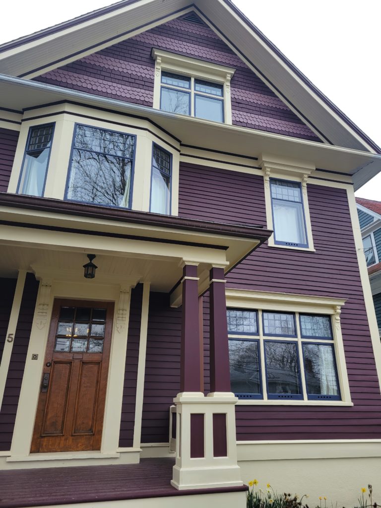
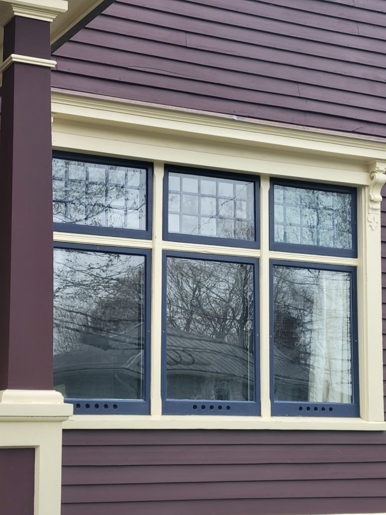
Our home was intended to be modern in 1910 when it was built. This meant that choosing a colour in an historically accurate palette was a challenge. Should we go with the craftsman earthy palette (close to the timeframe when the house was built) or a more gothic Queen Anne feel (also close to the timeframe when the house was built)? When looking at the house we could see the body in the 1920s photo was quite dark. The previous owner had found some colour below the paint we had thought was a burgundy – it might have just been a protective sealant – who knows. The house had also been a mint and dark green when it was bought in 2014 before being repainted an earthy beige. We were moved by a Vancouver home built in 1910 that has an historically accurate palette of cream, burgundy, and blue and used this as inspiration.
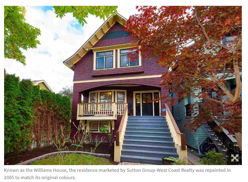
I remember a talk many many years ago by Don Luxton where he said homes built around 1910 had three colours and never white because white looks dingy against a grey sky. Despite the objections of some and with much great advice too, we chose a stained body of a burgundy wine against Sausalito yellowy cream and Victory Blue details. Our first go at the burgundy did not go well. It had a CPR red feel to it. My great uncle used to work for the CPR and would get the paint for free (possibly stealing) and he had everything in that colour. While I like the colour, it is just not the burgundy wine we were looking for. We got a number of samples and gave them a go – see the pic below.
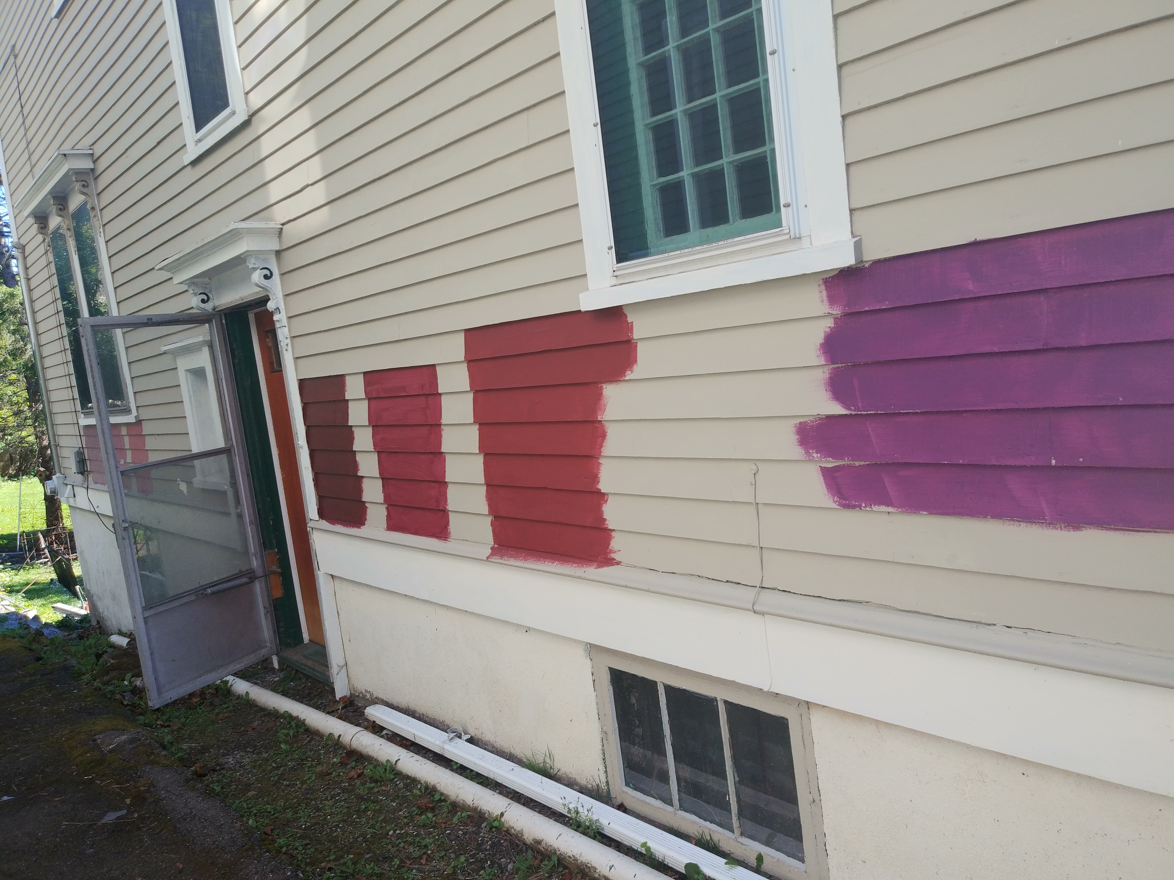
Some were much too purple (I had the One Eyed Flying Purple People Eater song playing in my head for a while along with visions of the purple bridge in Cincinnati) and some a bit too pink – until we found the colour that was just right for our stain.

The stain vs paint issue was a big one but I went with my father’s advice and stuck to stain – you do not need to scrape over time as you restain. Time will tell if we made the right choice.
Our restorers made use of tools from our beloved Saint John Tool Library.
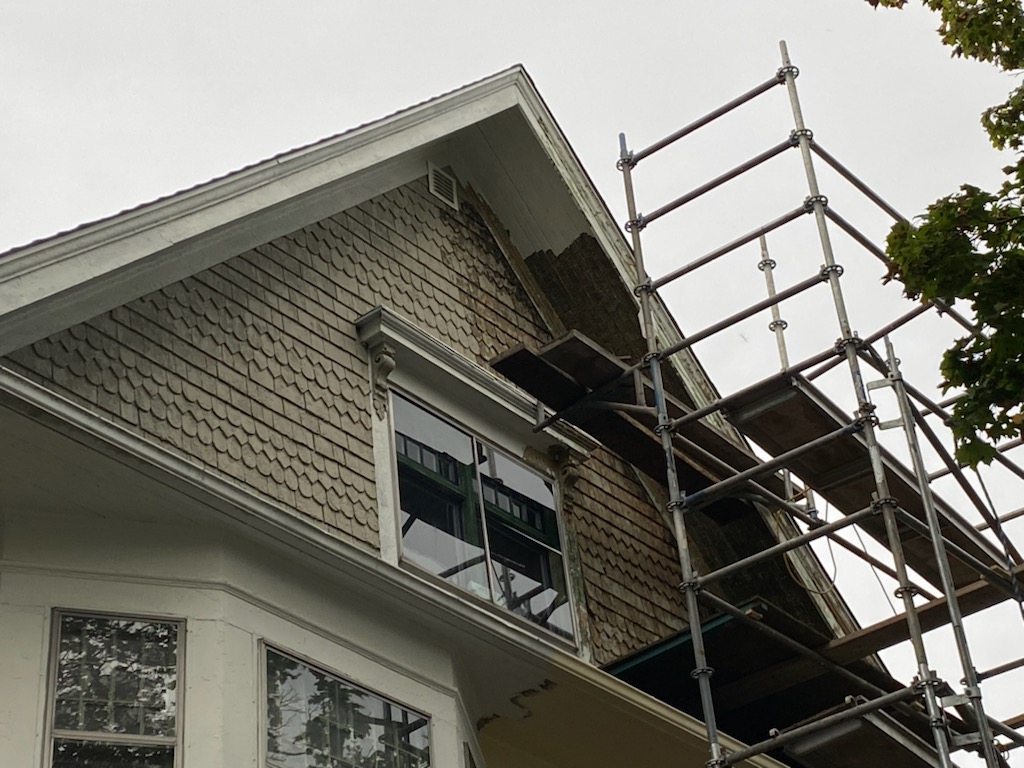
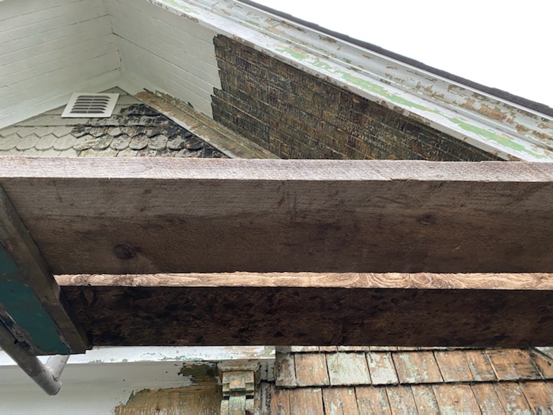
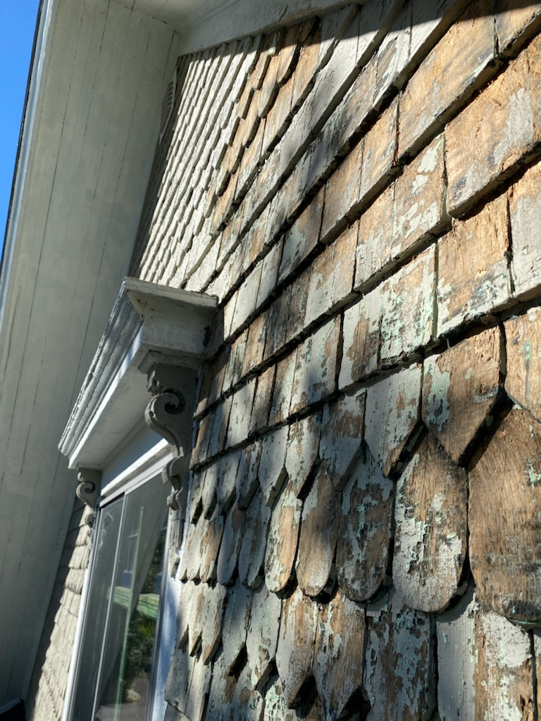
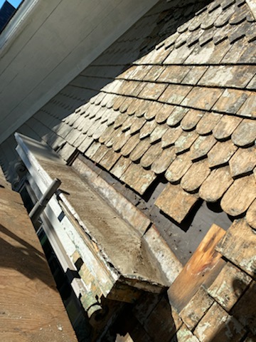
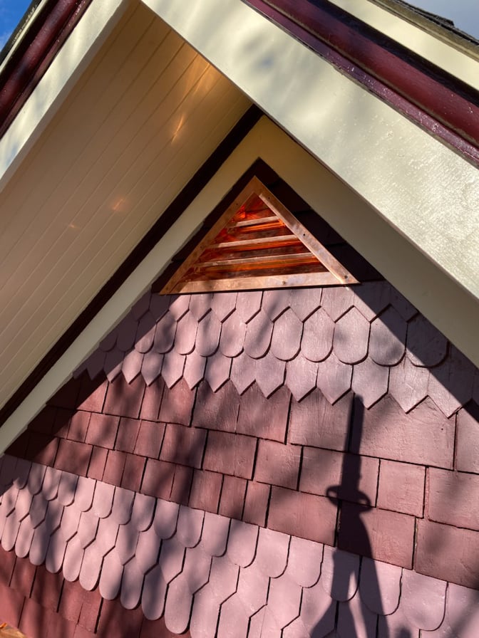
We have cool varying shapes of tiles on the gable. I had originally wanted to paint them in blue like the pic from the home in Vancouver but we decided this might be a bit too much like a zebra. Instead these tiles are painted the same merlot / burgundy wine with just with less intensity so you can really see the architectural difference. Meow. As you can see below, it took some effort to restore and revive the tiles.
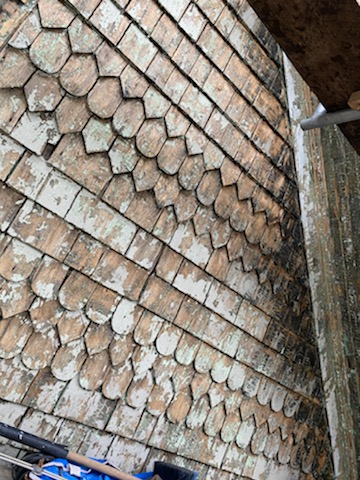
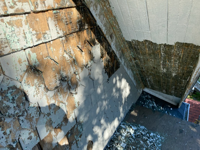
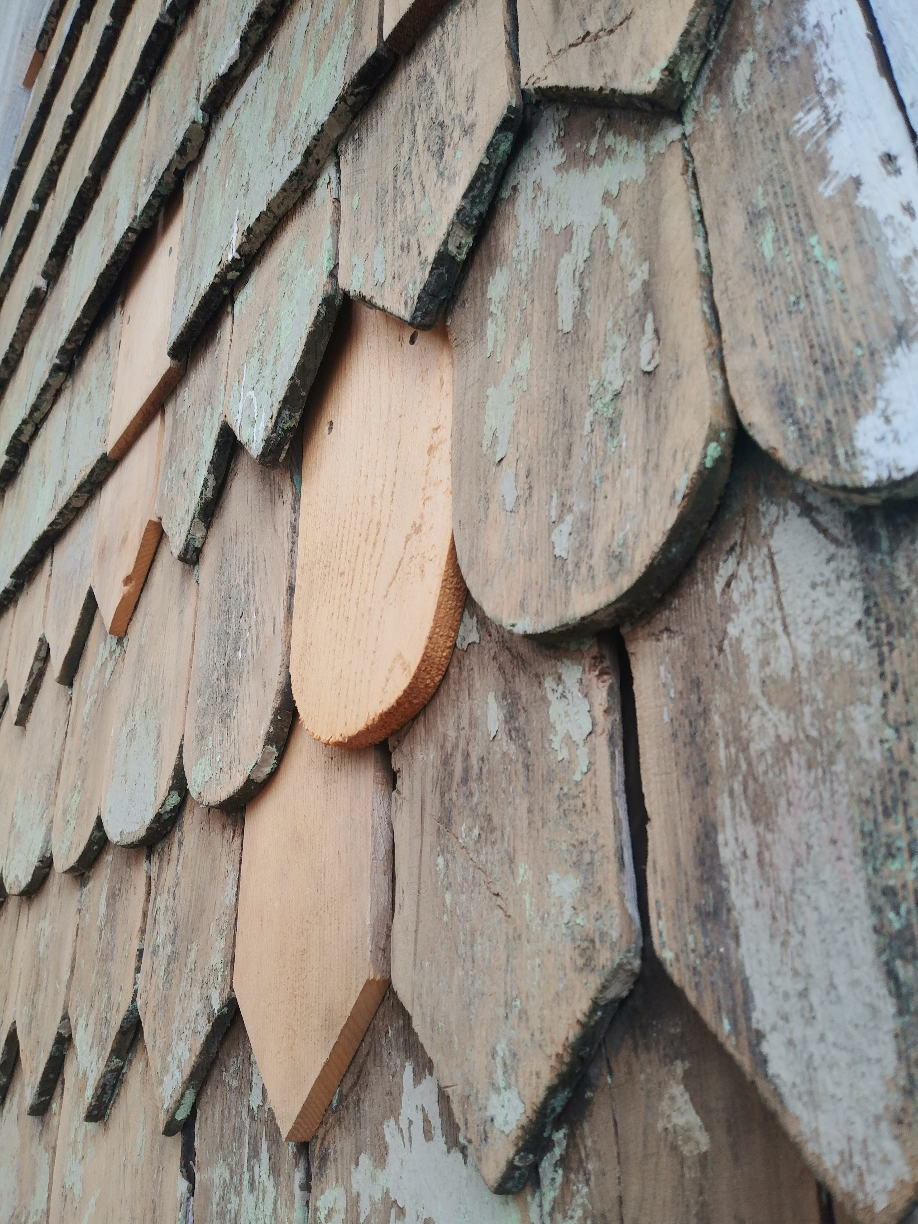
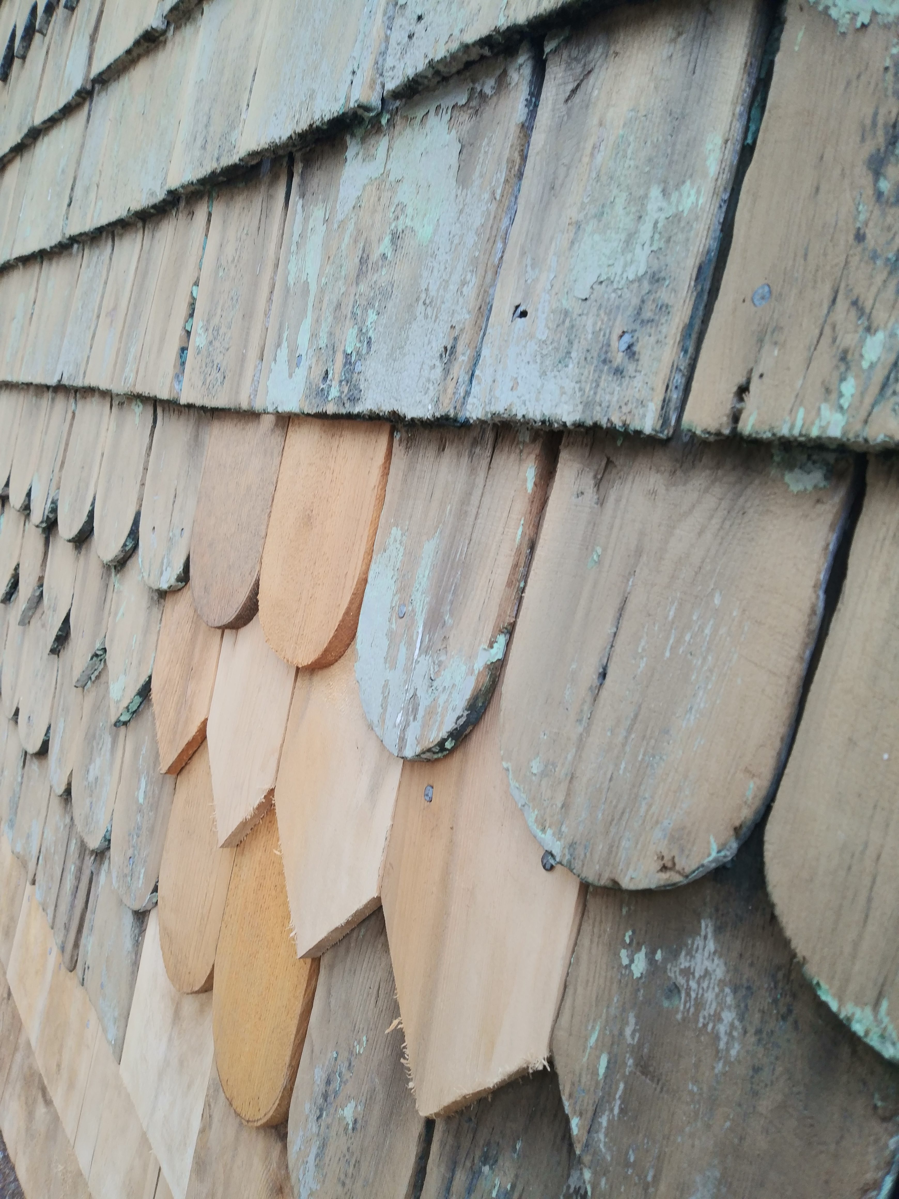
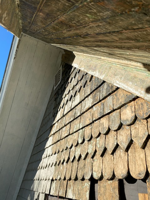
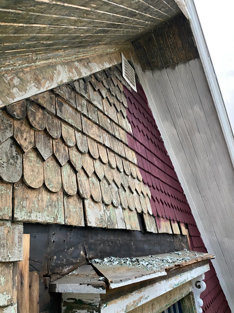
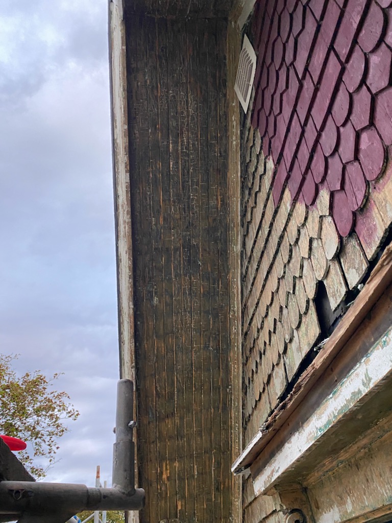
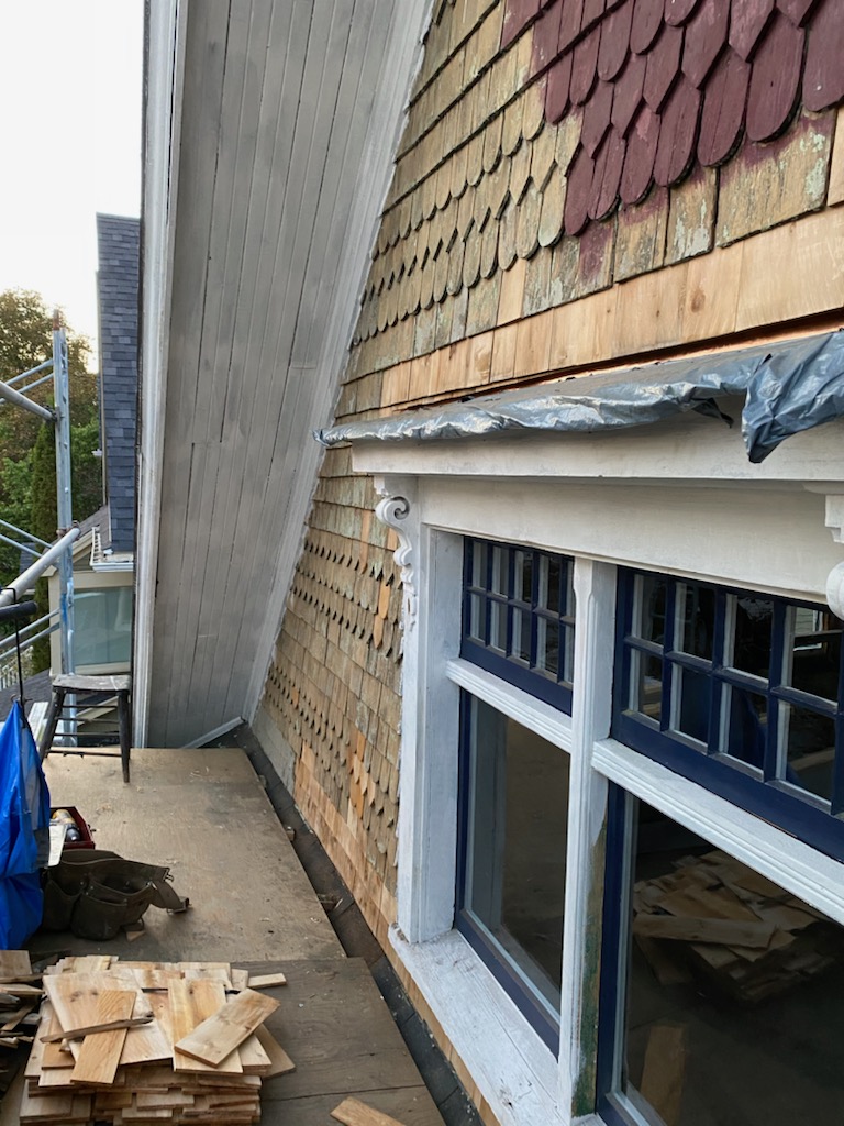
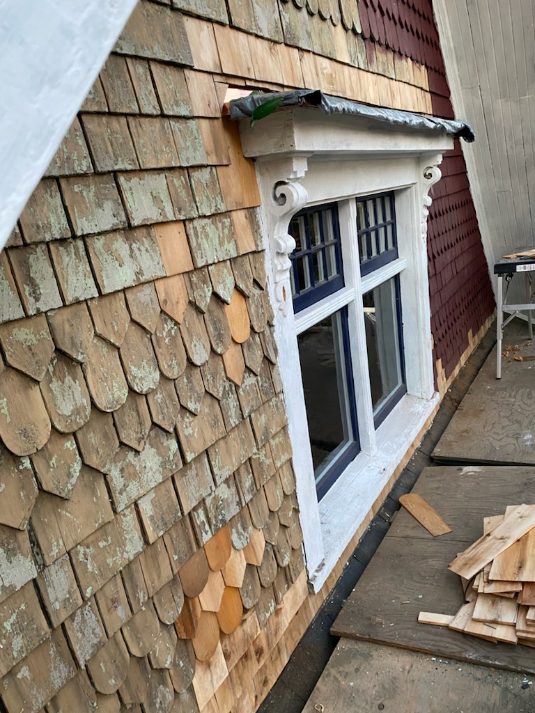
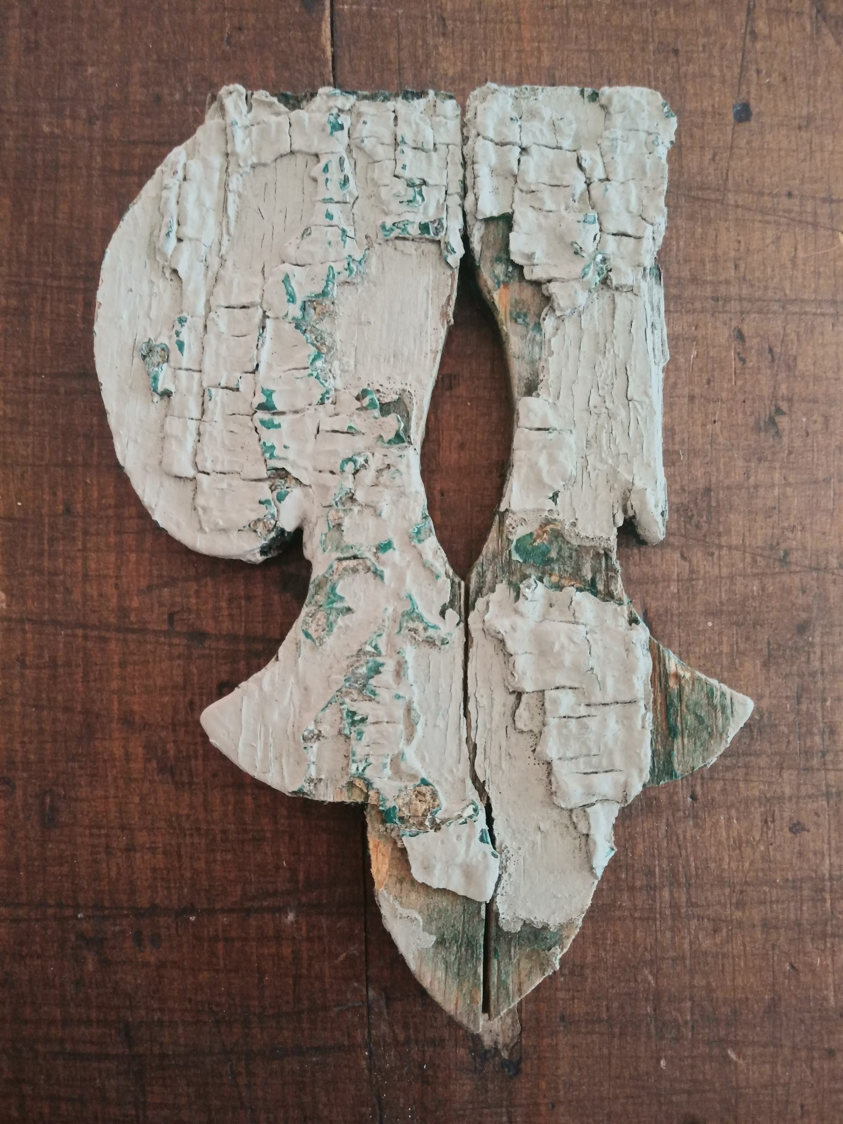
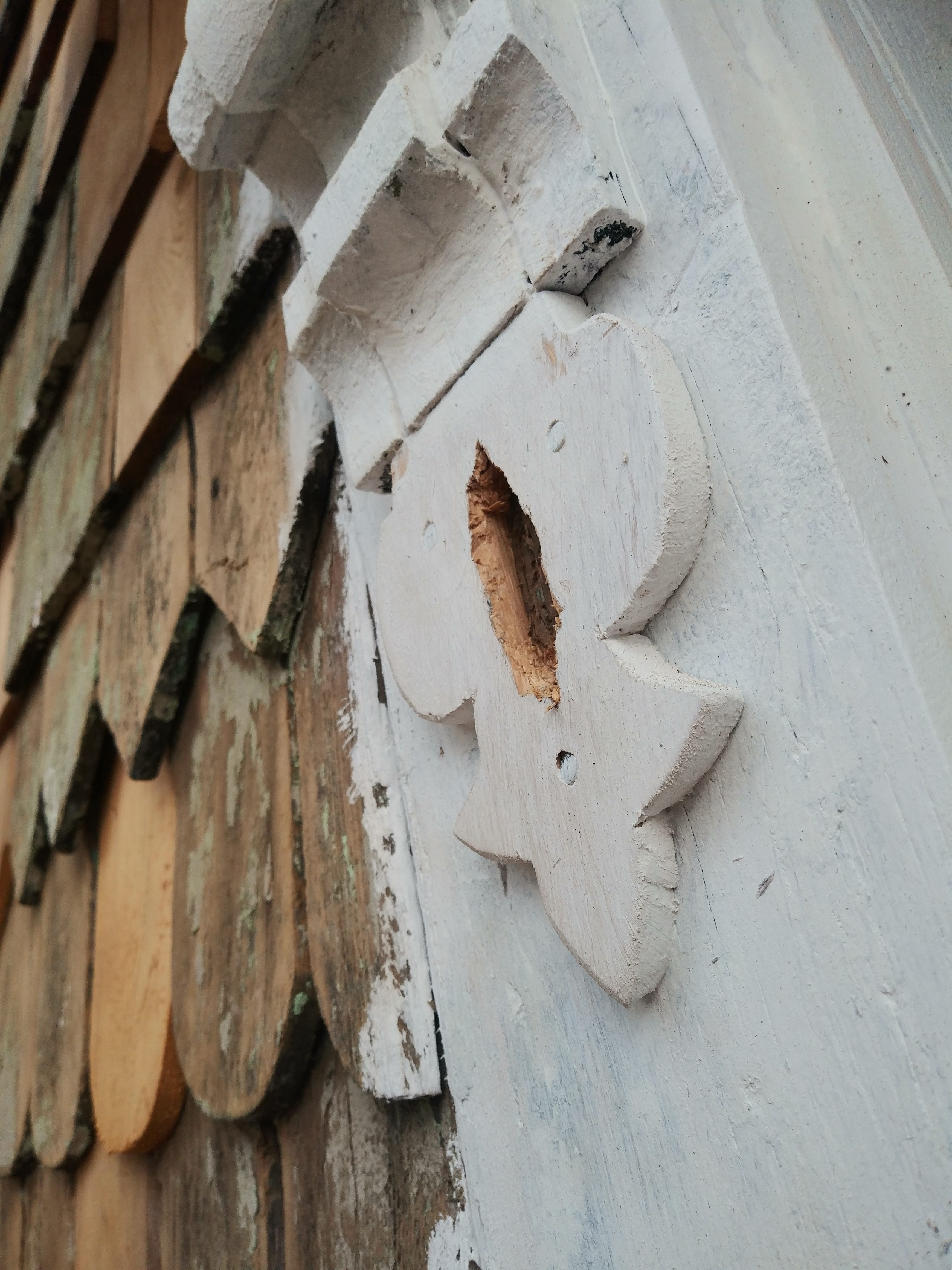
Sadly one small piece of our decorative moulding had to be recreated.
Now our gable looks like this.
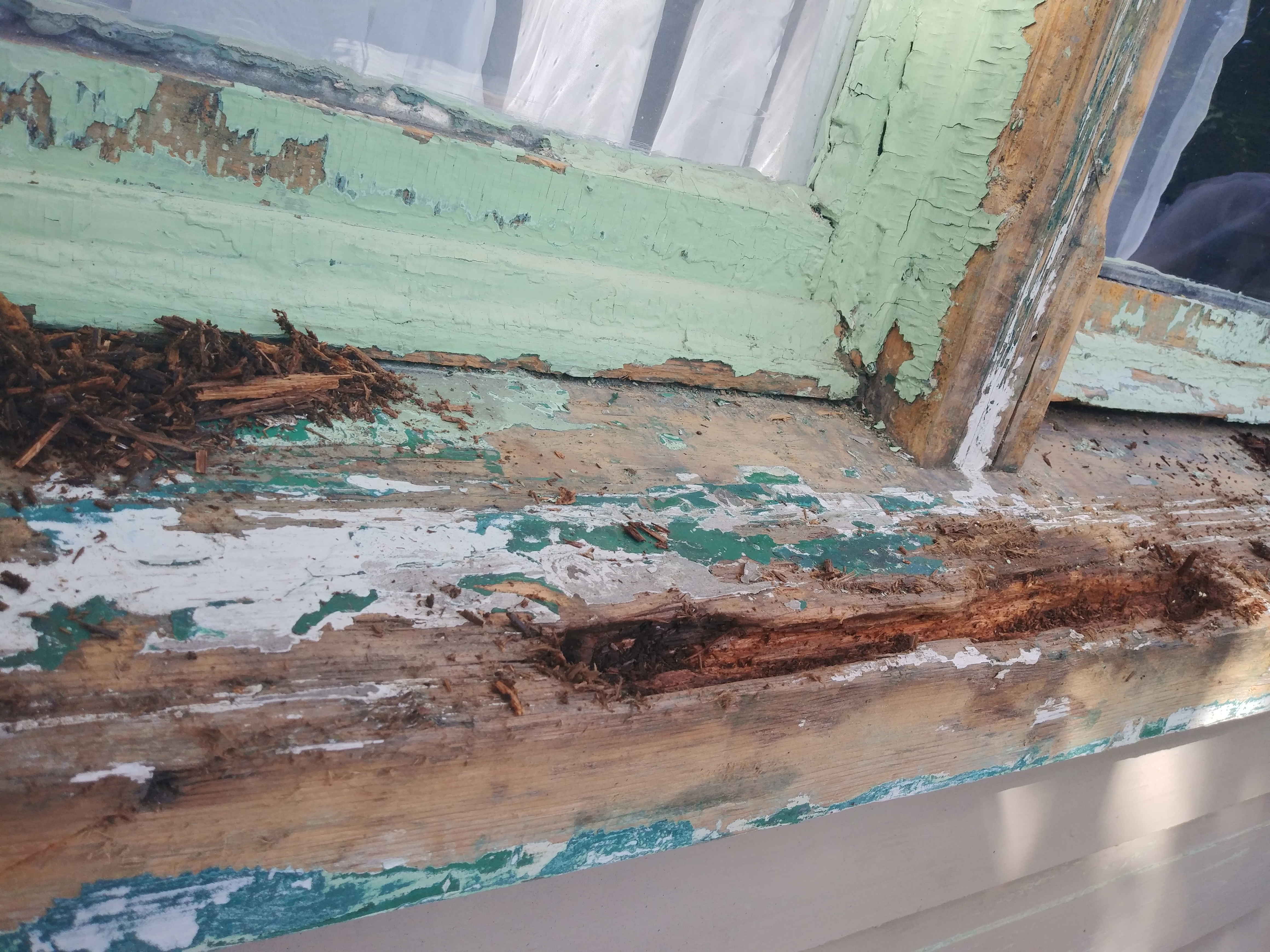
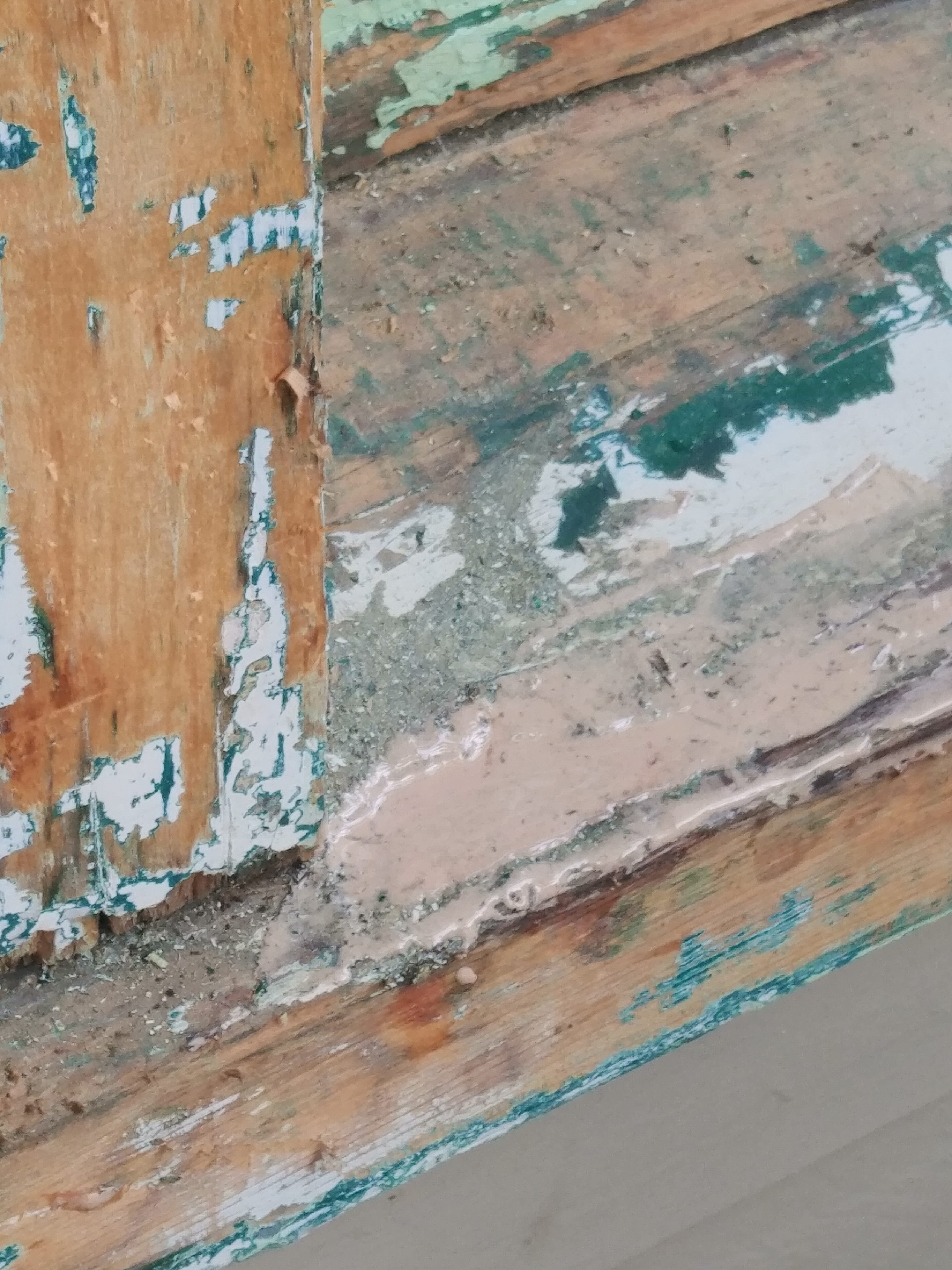
We discovered significant rot around the windows and this facia (part of it had to be replaced – it crumbled to the touch).
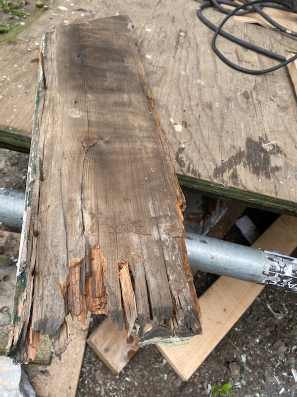
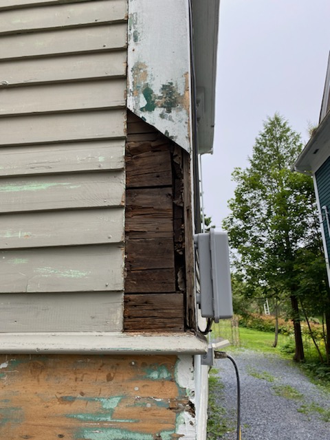
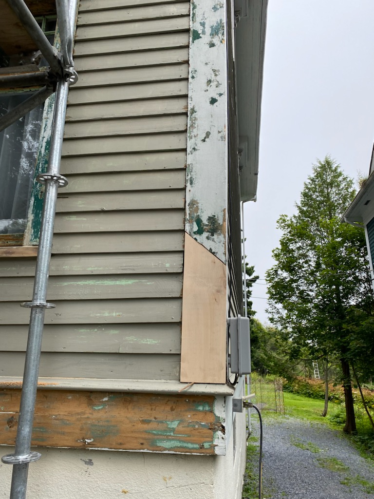
It is amazing to me how the window sill was able to be saved.
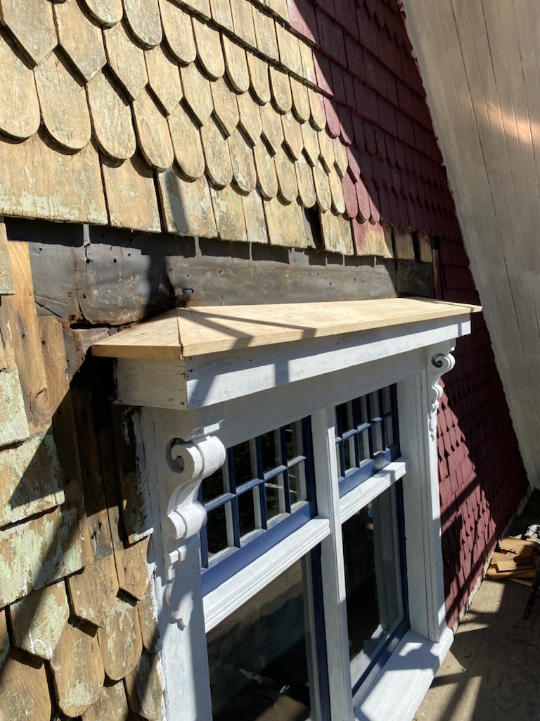
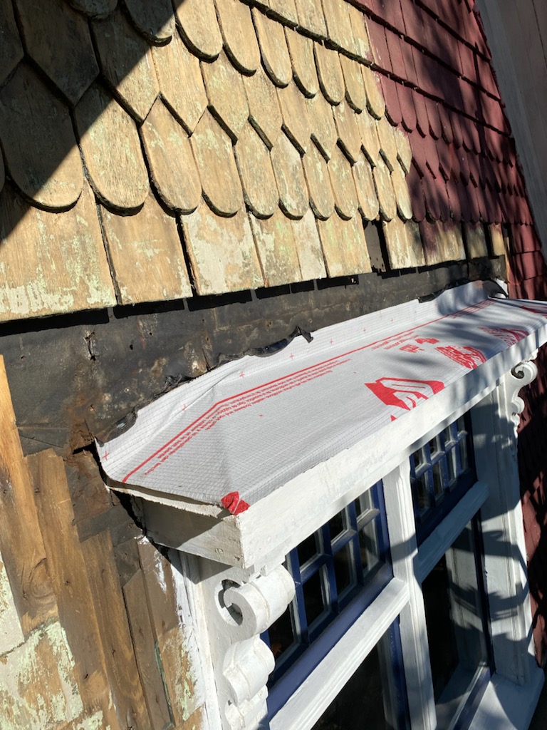
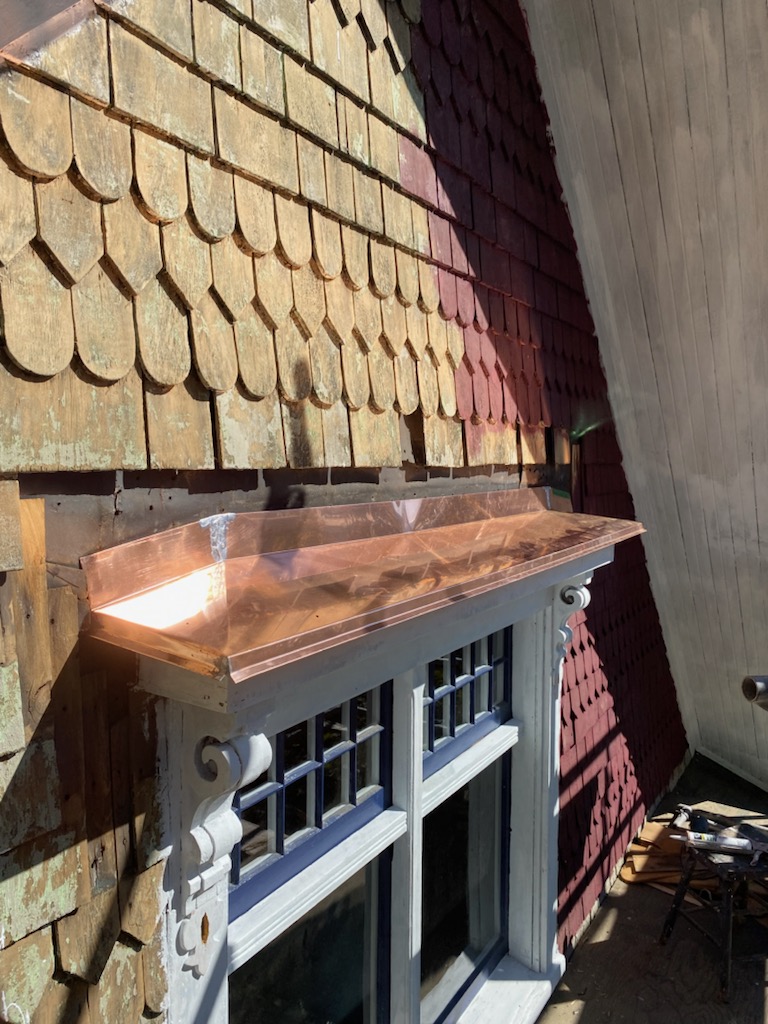
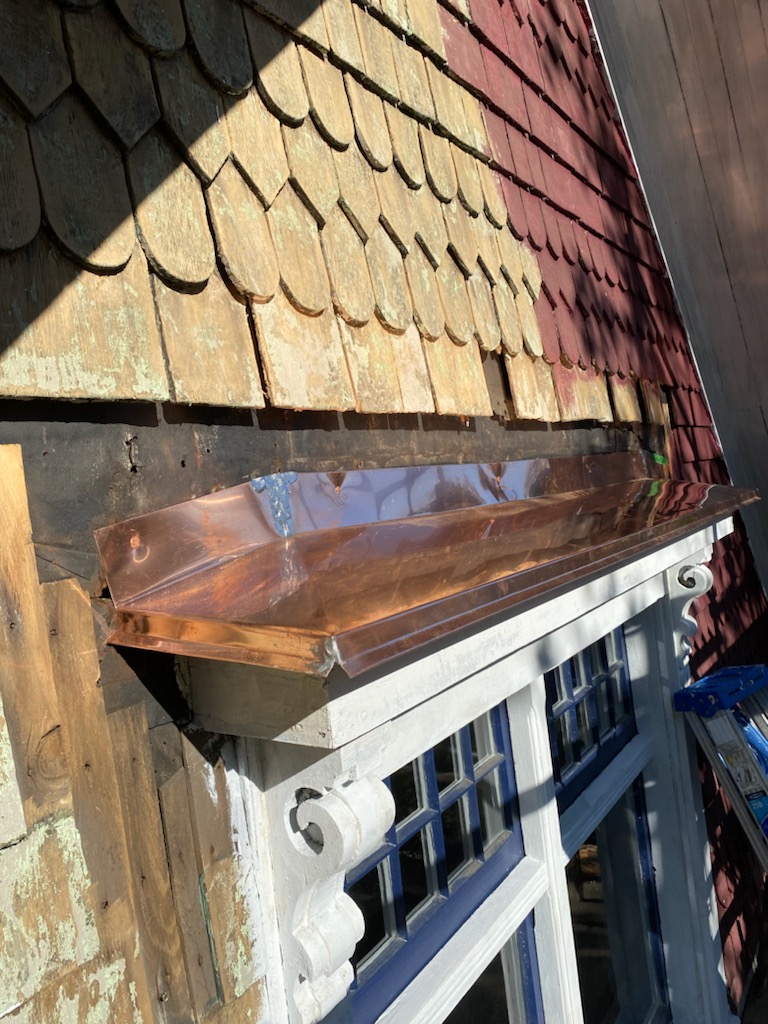
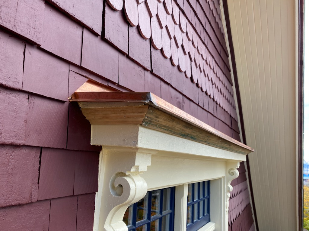
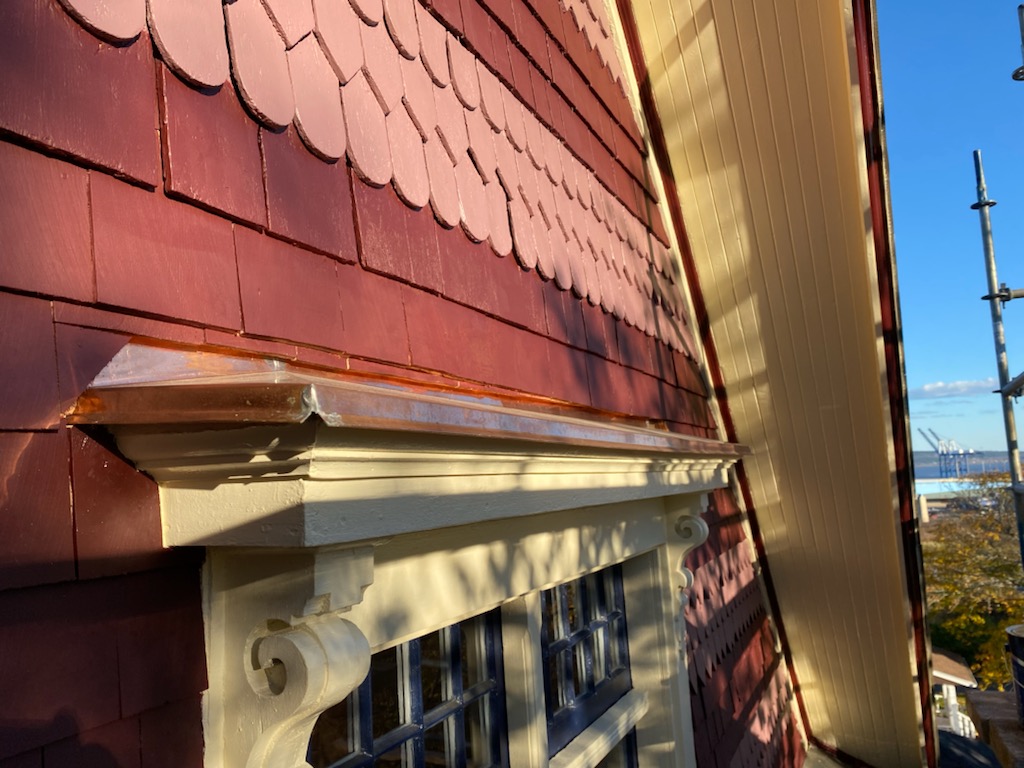
We opted for copper flashing above the window details to see the home through the next 110 years. See https://www.copper.org/applications/architecture/arch_dhb/arch-details/roofing/ for more details about copper construction. Also see Old House Guy too for historical gutter information (this blog is everything!).
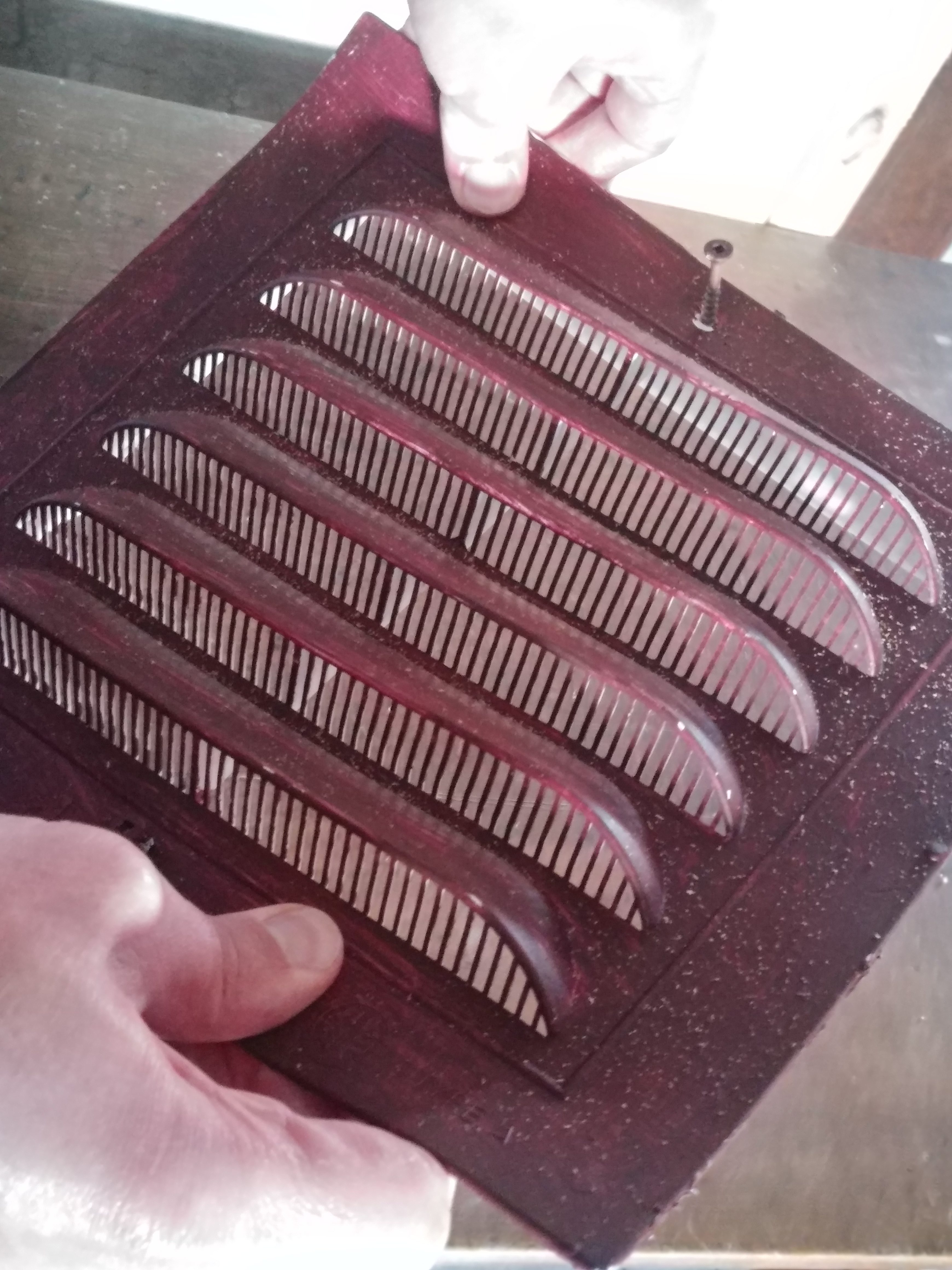
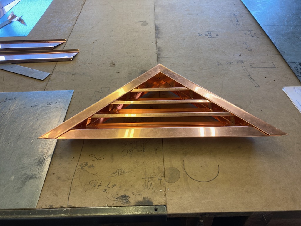
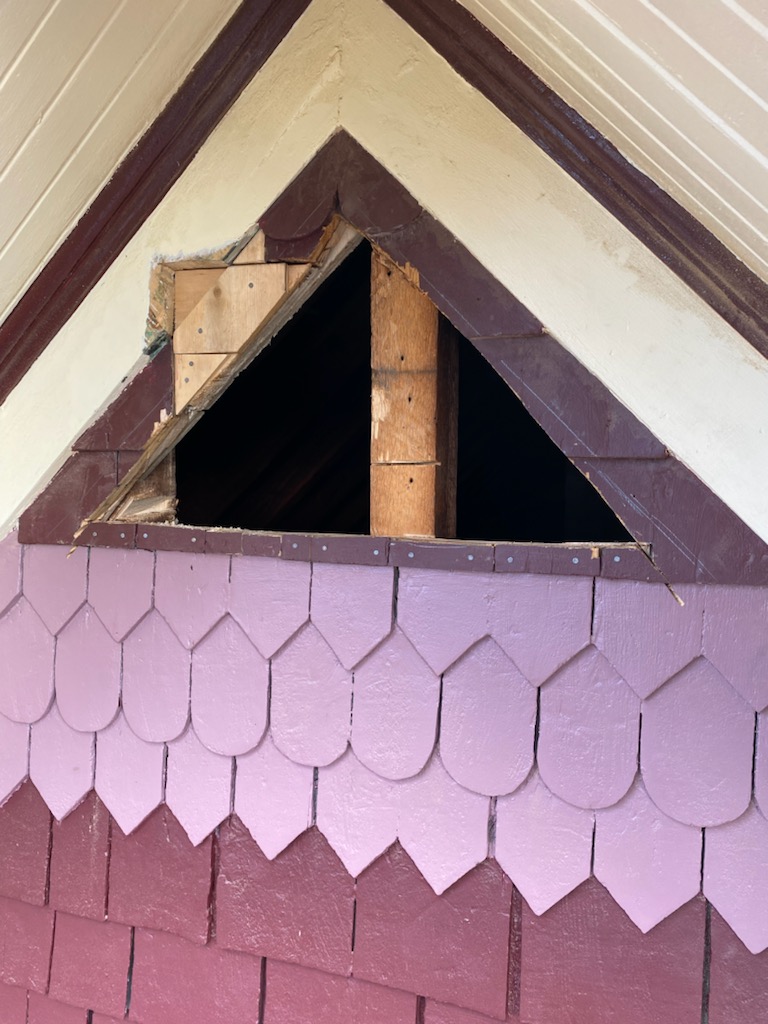
And a special shout out to our sexy copper attic vent. There is a beam in the attic which explains why the vent was not symmetrically installed in any of the five original Alexandra homes with our same floor plan. See this house on Dever Road as an example of well shaped and installed attic vent detailing.
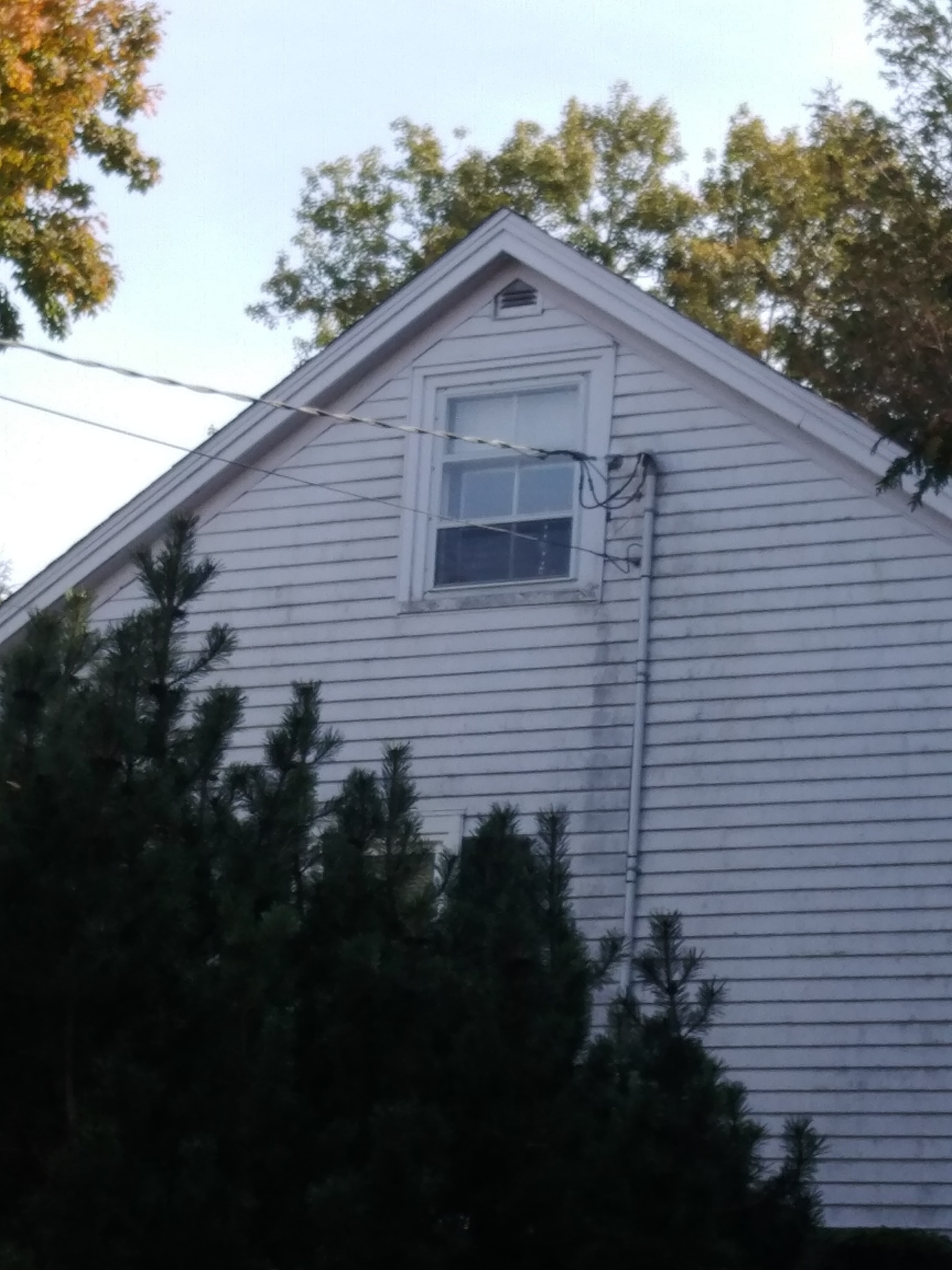
It is possible to rethink the shape and rethink the shape he did when our restorer came up with the design and had this beauty put in place. This is what we started with – a fugly plastic vent.
This is what we ended up with – a suitable shape and material for longevity.
Then there was the install process…
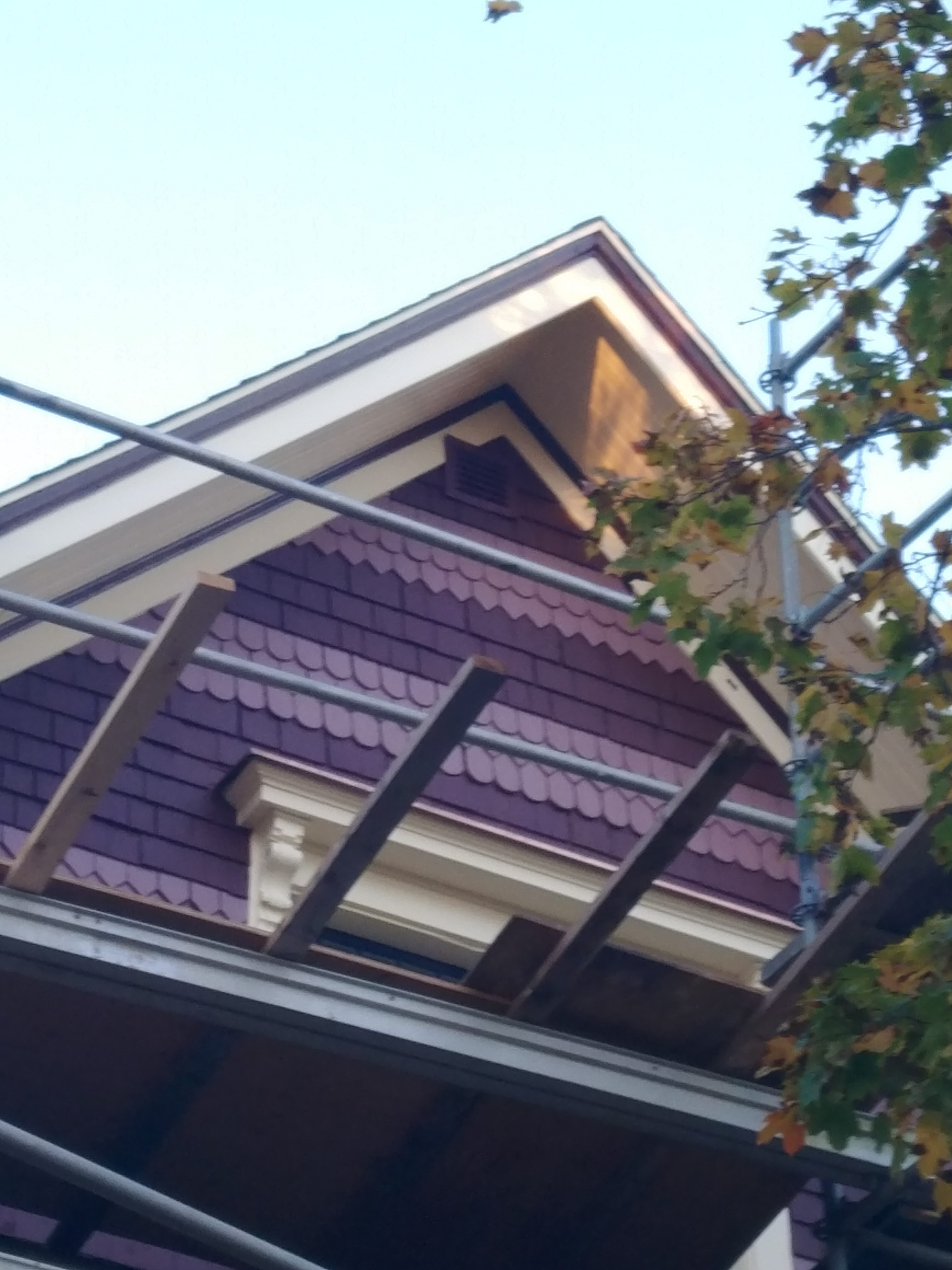
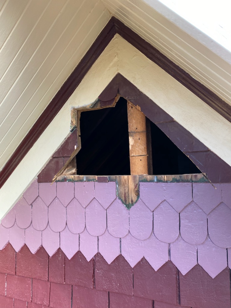

Currently our roof has a warranty on it but when the roof needs replacing and the warranty is gone, we will look at a historically accurate metal roof which I believe was original to the house – and there are many great examples in Fredericton to inspire us, along with two photos of this street in the 1910s – when you squint you can see the metal rooves.

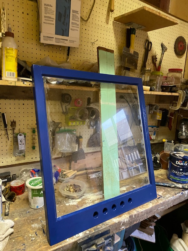
We completed only the front of the house this year because the old paint must be scraped and this takes a long time along with addressing the windows and creating and installing historically accurate storm windows. The original storms were removed long before us which is tantamount to a crime against architectural (Seaside Woodworks and our restorer fixed this problem). Stay tuned for photos as the storms are put back – right now only on the front but I will write just about storms.
 B
B
Below you can see the stunning subtle details around our bay windows being exposed as decades of paint was removed.
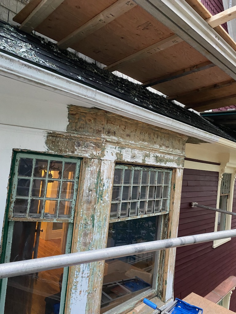
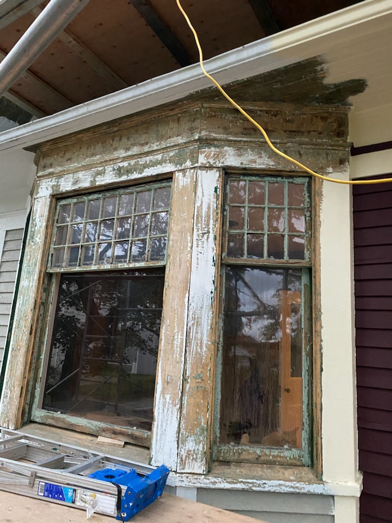
In removing the paint, we discovered these beautiful chamfer details around the windows.
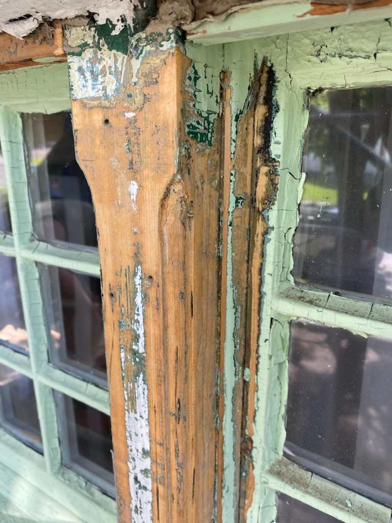
Ours is not the most extravagantly beautiful home in Saint John. We have a nice home but just around the corner are proper mansions. Our home has subtle and understated details. Funny, I should end up in a subtle and understated home when neither of those descriptors have ever been used to describe me. Anyhew.
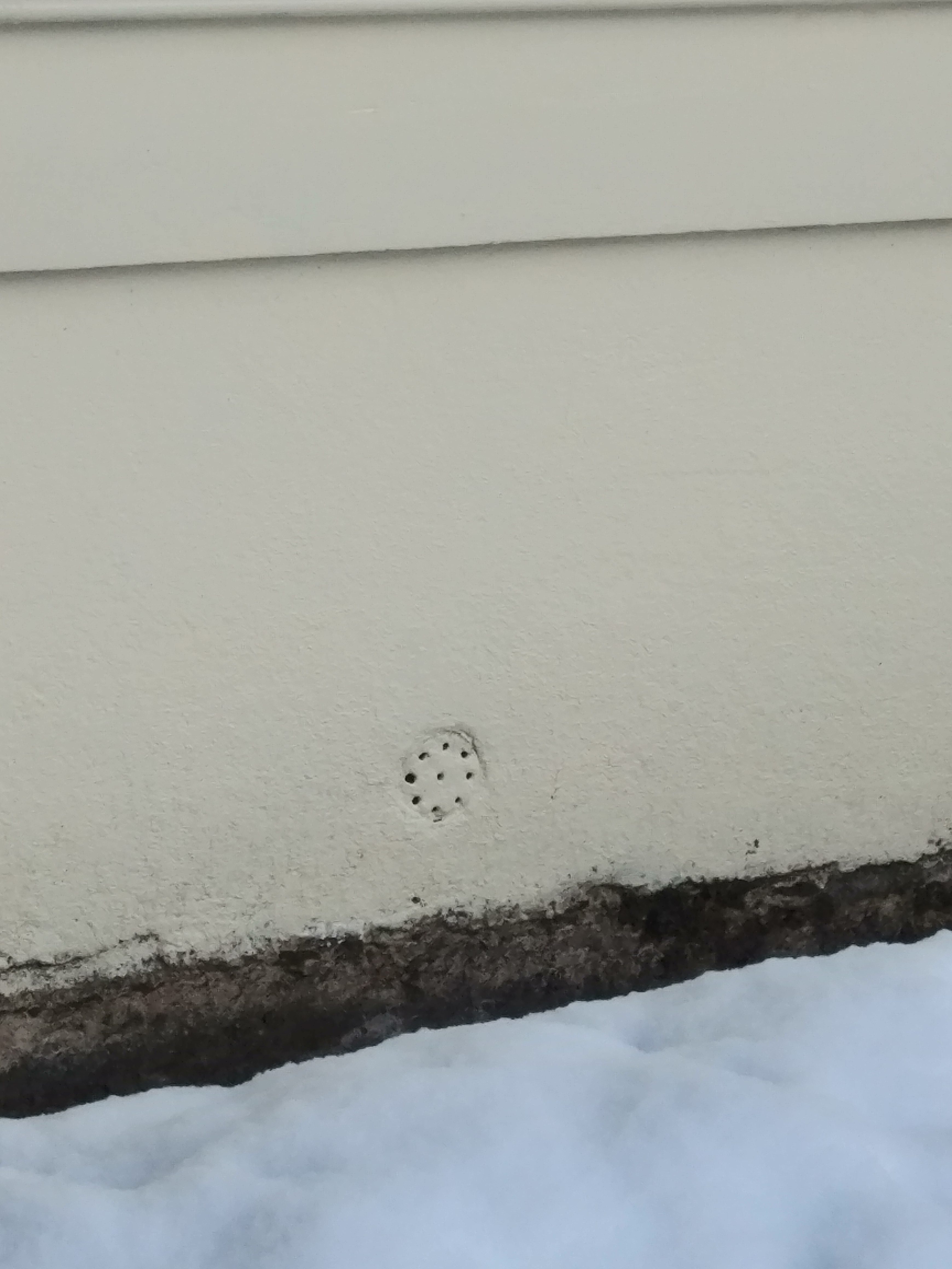
Note this cute little detail below our window that allows some air to circulate in our basement. I make sure to never cover this detail. Another well thought out necessity by the original builders.
Next year the back will be completed. Well, my dream is the remaining three sides but the experts do not think this is possible in one summer. Saint John is a city with phenomenal architecture. We are so pleased to contribute to our historic city landscape.

Looks awesome!
thanks!
Carrie beautifully and lovingly done. This was so interesting to read. We lived above you, at #1 Alexandra for 10 years, moving about 3 years ago to another old home on Manawagonish. Our time on Alexandra, in that little community, was wonderful. Congrats and enjoy. Sheryl Crowley.
The blog written about your house – was the impetus for us to look to buy one of the five original homes. Well hello former neighbour, please say hi the next time you are nearby and thanks for taking the time to comment.
I loved this. Dad was always buying and renovating homes but not really restoring. Love the colour you chose. I agree…grey weather and white homes a bit of a meh.
thanks – your dad was clearly talented!
Loved it. Brings back memories of Dads home renovations. Love the burgundy.
I really enjoyed this read! You are doing a magnificent job and really putting extra, extra care and thought into all details. More than once you’ve made me reconsider a few things when staring bemused at my project and often wondered WWCD.
Thanks! It feels like such a lot of big long-term decisions so getting feedback has been so so helpful especially when I knew so little going in.
Hi Carrie,
I accidently stumbled upon your blog this morning and am loving it! I had the pleasure of watching your restoration from my breakfast nook this past summer. My husband and I renovated the top flat of 218 Douglas Ave last year so we’re neighbours. I can’t wait to see the magic you create this summer.
Thanks Michelle. We plan to put on a metal roof one day -as it was in 1910 – and look to yours for inspiration.
Great job Carrie.
thank-you!